PROJECT  [ 00 - 2 ]
2020

 * THE COLLECTIVE

 * THE COLLECTIVE

 * THE COLLECTIVE 

 * THE COLLECTIVE 

OVERVIEW
INFO
Case study
June - 2021
Branding
/ Motion
Reimagining the music
scene in Copenhagen
Reimagining the music scene in Copenhagen
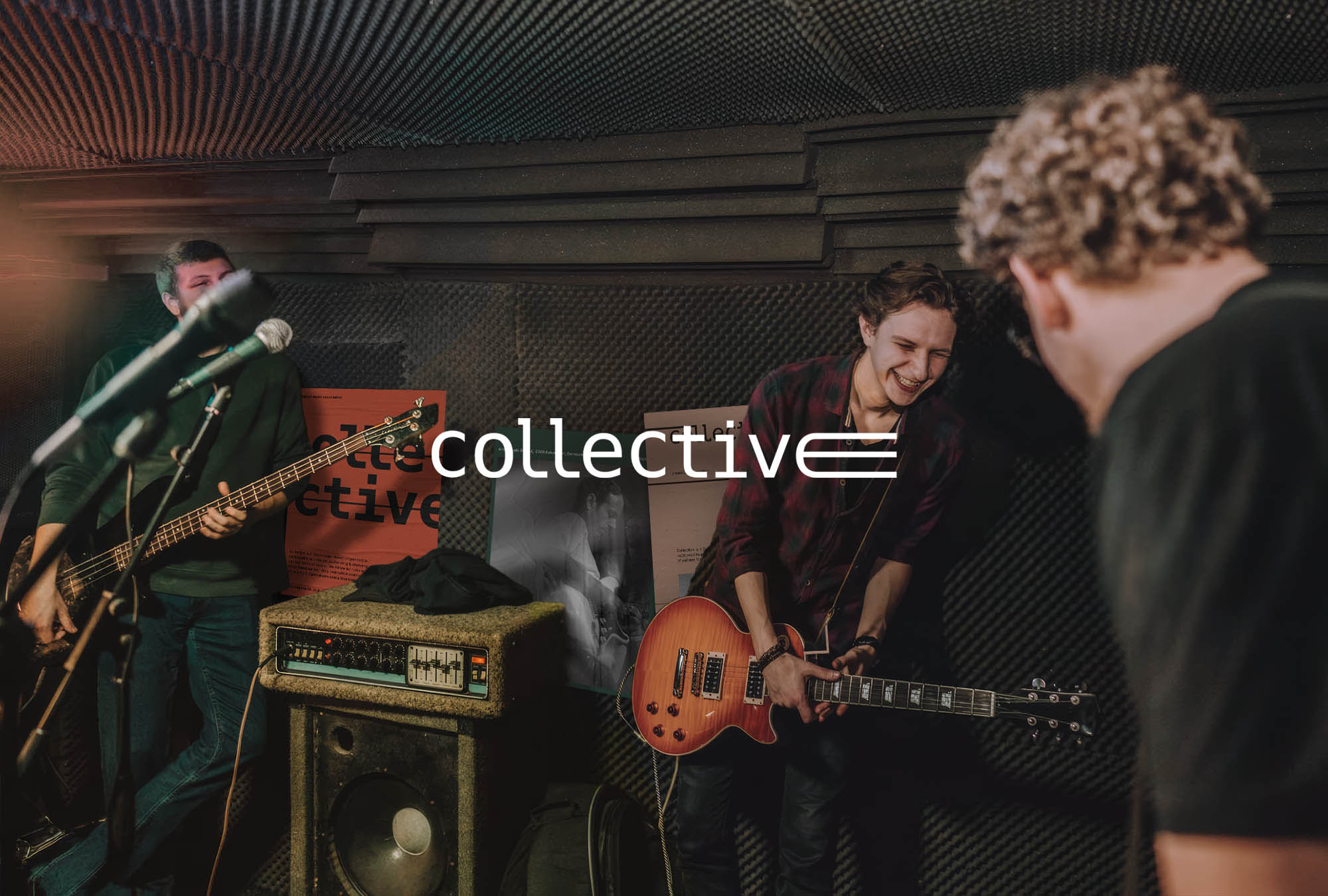
Collective is a Danish musical organisation dedicated to pushing the boundaries of sound and creativity. Rooted in the rule breaking musical tradition of Copenhagen, Collective aims to uplift upcoming artists who are talented, uncompromising and true to their vision. And that mission needed a brand that matches.
OVERVIEW
Case study
Branding / Motion
June
2021
INFO
Reimagining the music scene in Copenhagen
Collective is a Danish music organisation dedicated to pushing the boundaries of sound and creativity. Rooted in the rule breaking musical tradition of Copenhagen, Collective aims to uplift upcoming artists who are uncompromising and true to their vision. And that mission needed a brand that matches.
[ 1 ]  THE CHALLENGE
The biggest challenge was building a brand that will reflect the values the Collective stands behind - curiosity, bravery and the love of music. I had to create and execute a concept that will depict the essence of the brand - being proud of the boundary-breaking musical tradition of Copenhagen and excited about the limitless possibilites that lie ahead.    .
[UP]  FLYERS
[LEFT]  MOBILE SCREENS
+

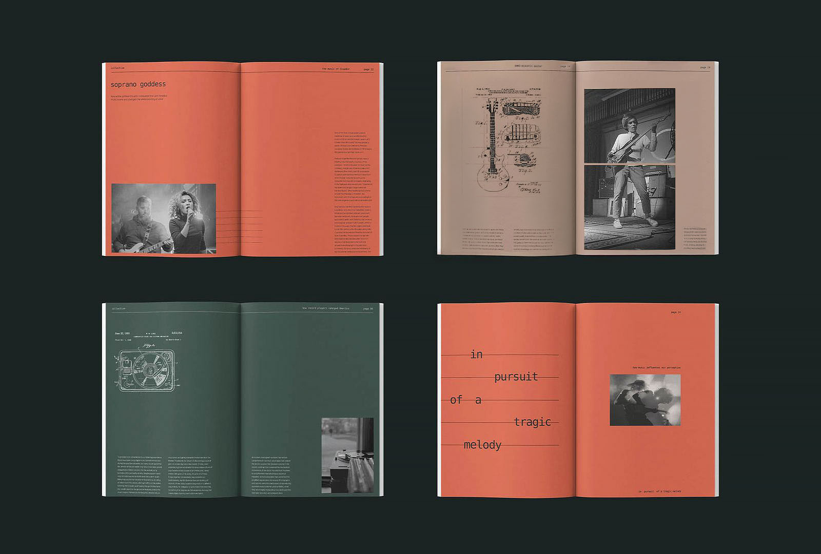
[RIGHT]  BOOKLET
[ LEFT ]
TOTE BAG
[ 2 ]  INSPIRATION
I was influenced by the the rich & complex music tradition of Copenhagen, from protest jazz of Uffe Baadh, to folk & psychodelic rock of The Savage Rose. The city itself was another crucial source of inspiration, the way it looks and feels, the way it has shaped both the people and their art.

Inspiration came from visual hues I saw around me. Cobblestone streets, orange-reddish brick walls, order and geometry, warmth underneath cloudy sky. But also from the music itself. The surface of a guitar, ridges of sheet music pargement and vibration of strings.
[UP]  INSIDE BOOKLET
[DOWN RIGHT]  BILLBOARD
[ 3 ] THE SOLUTION
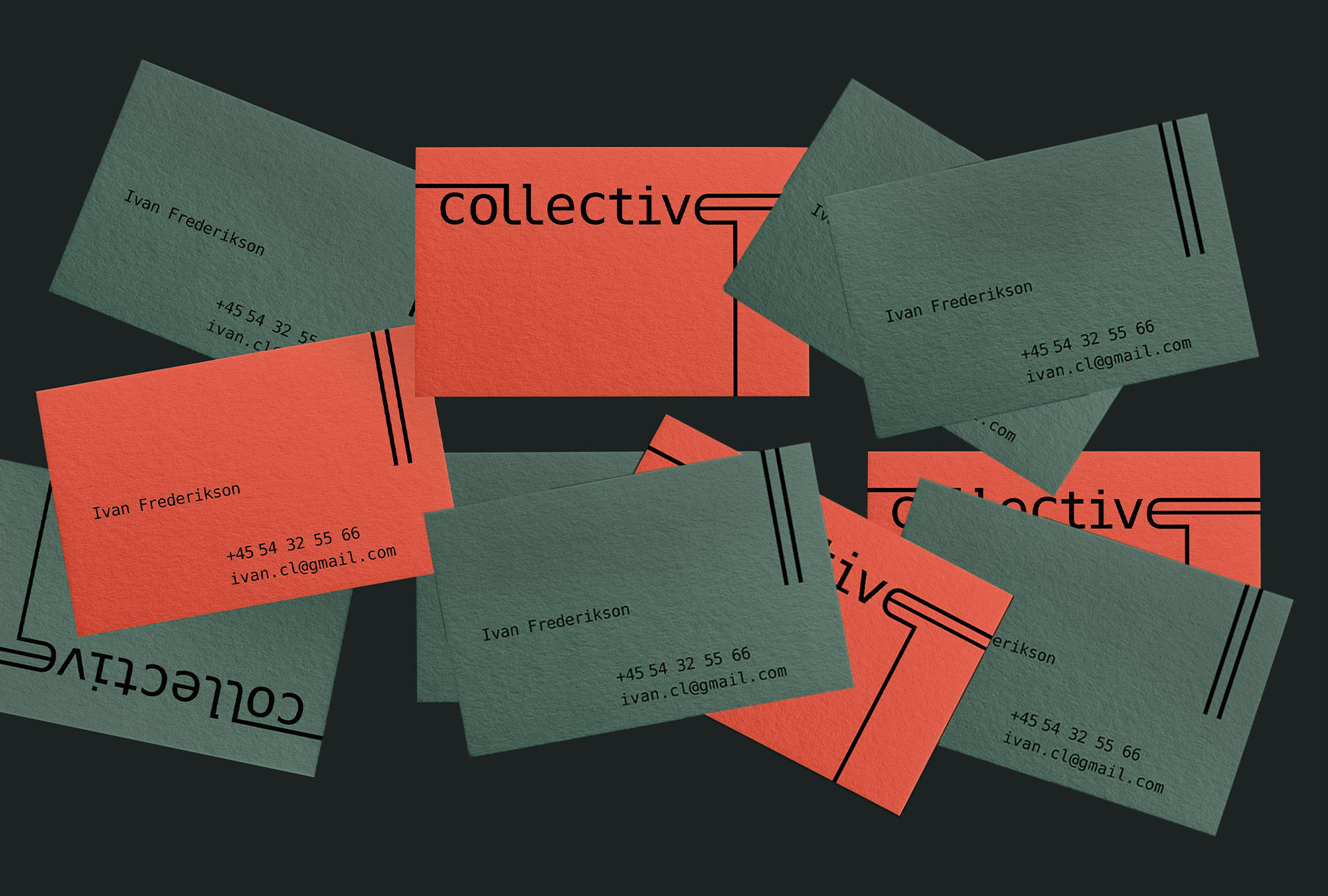
Understanding how the city, the artists and their ideas were all intertwined was crucial. Deja Vu typeface, with good balance of curves and straight lines suggests the order and stability while colors, namely salmon orange, moss green and cream white are indicative of both the city and the musical paraphernalia.

With vintage-inspired imagery and the encouraging tone of voice, the brand is all about igniting the feelings of curiosity and proudness within the artist. It is about making them feel like they have found their place within the walls of the city that nurtured so many great talents before.
[LEFT] STICKERS
[DOWN]  STATIONARY MATERIALS
[DOWN RIGHT]  CASETTE DESIGN