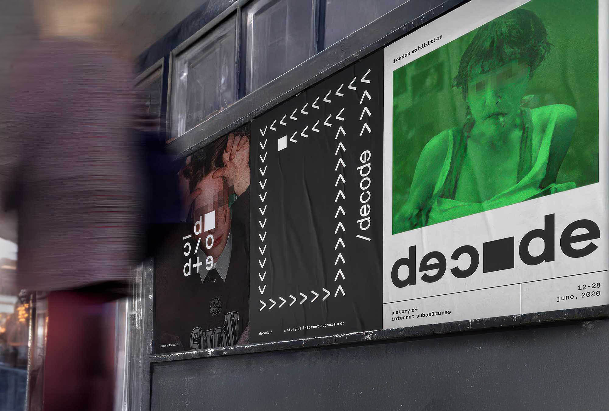
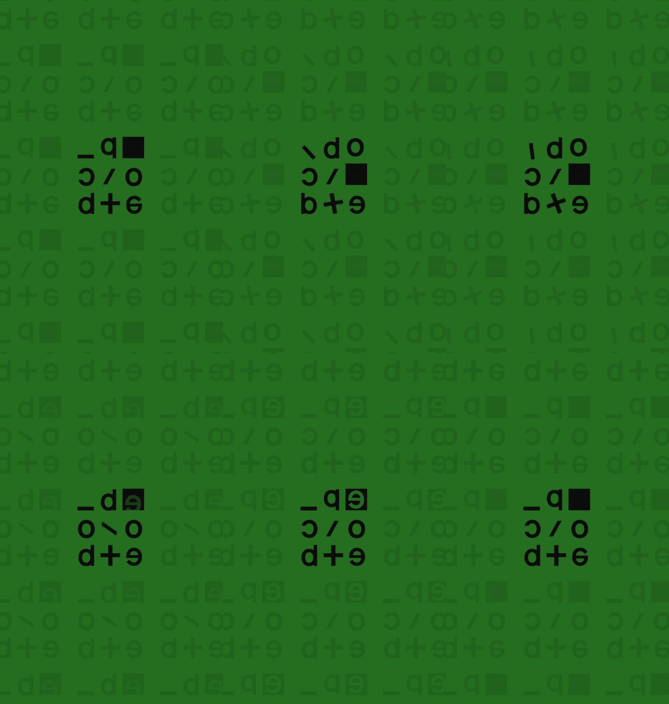
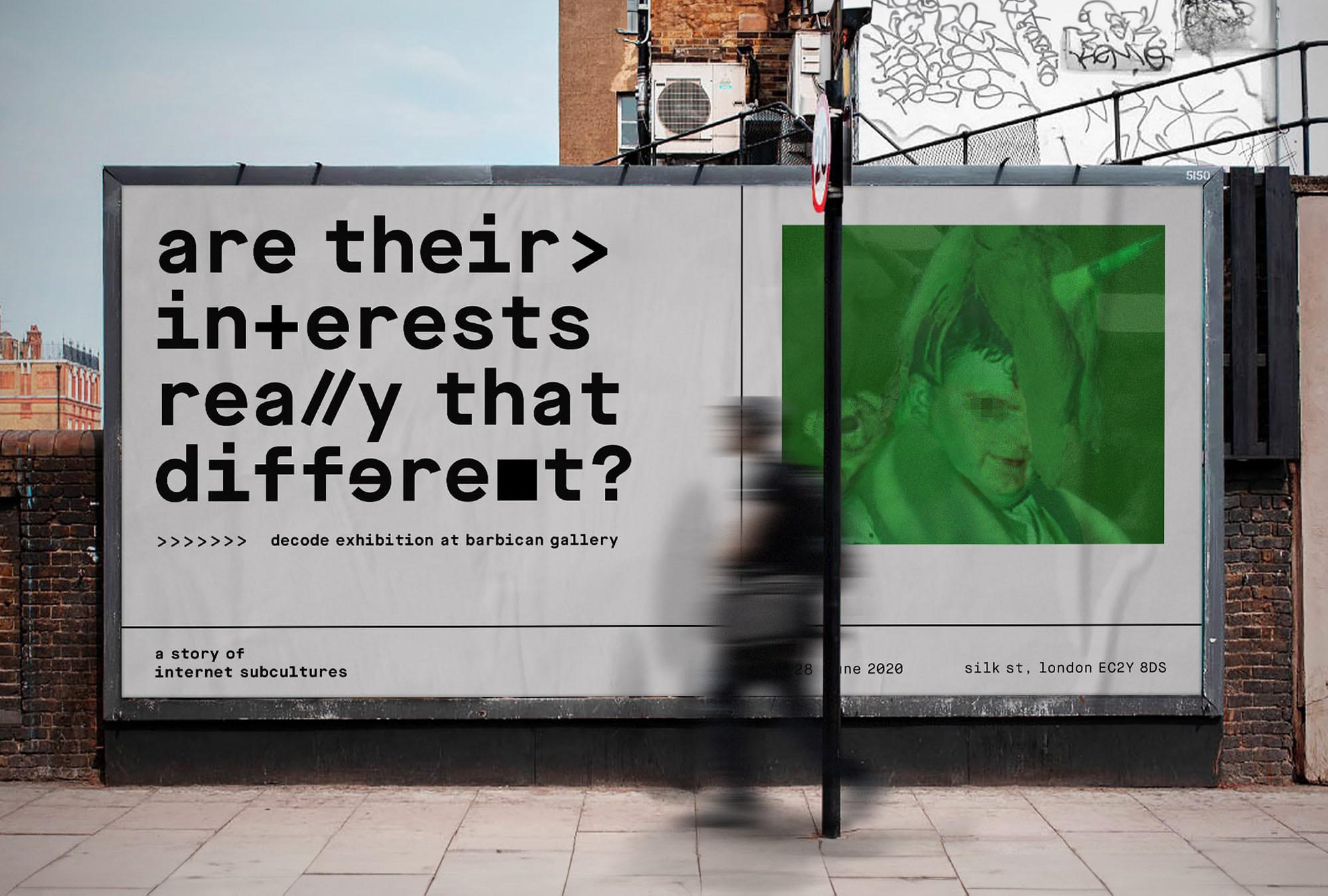
A heavy moss green that encapsulates the feeling of early 2000s tech was chosen as a main brand color. 2 versions of Maison typeface, alongside with 4 shapes emulating different coding symbols serve as the backbone of visual identity. Images used are raw, gritty, showcasing the unedited version of people the exhibition revolves around.
Copywriting is interrogative in nature, asking the audience how they see themselves and how they relate to different subcultures they are observing. I wanted the message to be reflective in nature, making you realise there are bits of them in all of us.


.jpg)


.jpg)


